Brooks Running
Project Type
Event identity / Branded experience
Role
Creative direction, concept development, visual identity, and event system design across invitation, apparel, signage, and race-day touchpoints
For Brooks Running’s 100-year anniversary, I designed the visual identity for Run to the Future, an internal employee 5K created to celebrate the company’s past, present, and next chapter.
The idea was part race day, part birthday party, part time capsule. I built a bright, energetic system with a playfully futuristic vibe that could carry across the whole event, from the first invitation to the bibs, shirts, signage, and sea of neon green on race day.
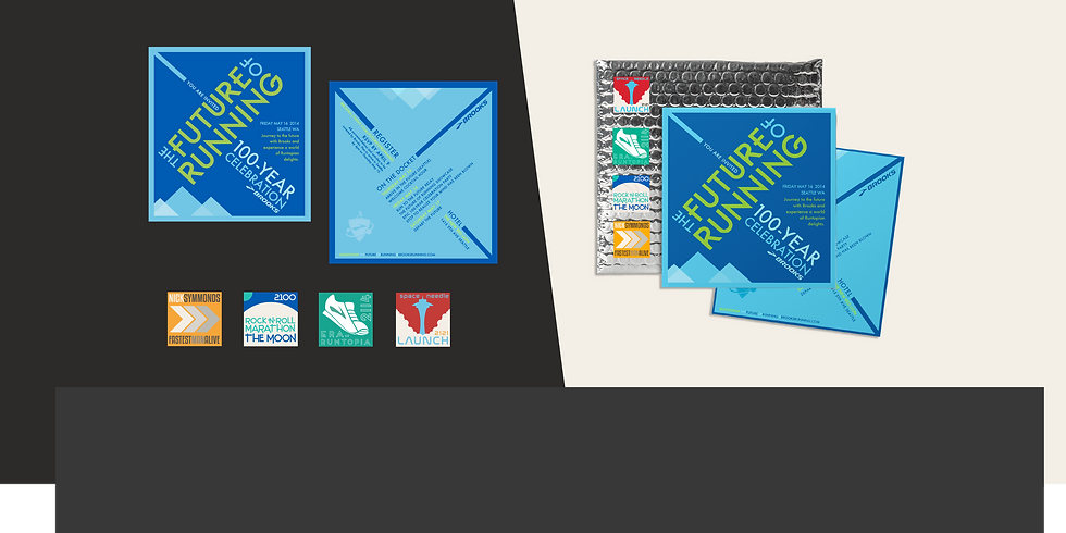
The Invitation as the Starting Line
Built around sharp angles, layered blues, high-energy green, and directional type, the visual system gave the event a sense of speed, momentum, and future-facing optimism. The fold-out invitation kicked things off before race day, with custom graphics and commemorative stamps that nodded to Brooks history, running culture, and the tiny delightful details that make something worth keeping.
Race-Day Identity
The bib and T-shirt brought the system into the actual 5K. Once employees were wearing the shirts, pinning on numbers, and gathering for photos, the identity stopped being flat artwork and became part of the day itself.


