Band Identity + Album Packaging + Promotion
Project Type
Role
Founder + Creative Director + Frontperson
Goodwin
Goodwin was my band from the ground up. I conceived the project, wrote the songs, sang lead, played guitar, assembled the musicians, booked the shows and studio time, and built the visual world around it.
I developed the identity across logo, album packaging, posters, merch, promotional graphics, and Bandcamp, giving the band one loud, graphic, slightly crooked little universe. The music and design grew together, each sharpening the other.

The Logo
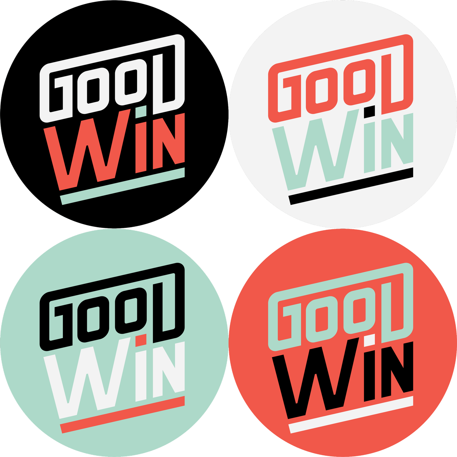
The logo turns the band name into its own little visual joke, splitting Goodwin into GOOD / WIN and giving each half a different weight and attitude. I paired chunky, squared-off lettering with an off-kilter stacked structure and a slightly unexpected palette, creating a mark that feels bold, retro, and just crooked enough to match the music. The system could shift between stacked and horizontal formats without losing its personality.


Logo Treatments
The logo system includes stacked and horizontal arrangements, along with light and dark applications for different backgrounds. That flexibility let the identity move easily from album packaging and posters to web graphics, merch, buttons, and other tiny-but-mighty band ephemera without losing the GOOD / WIN tension at its center.
Album Packaging
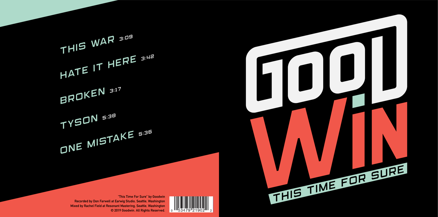
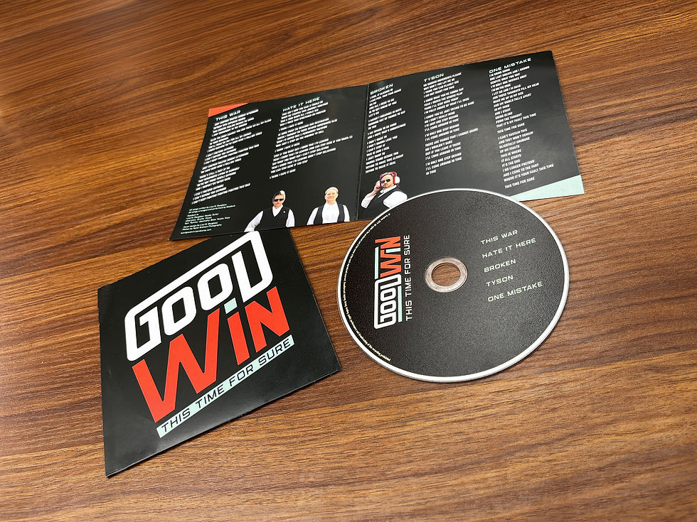
For Goodwin’s five-song EP, This Time For Sure, I made the GOOD / WIN split the centerpiece of a fold-out cardboard package. The bold cover and back panel were designed to hold their own across a merch table, while the interior opens into full lyrics, custom band photography, and credits. A matching disc carries the same sharp typography and limited palette through every part of the physical release.
Recorded at Earwig Studios in Seattle in 2019.

Posters + Merch + Digital Presence
The identity had to work everywhere a band actually lives: on venue walls, merch tables, guitar cases, stages, and screens. I used the GOOD / WIN split, limited palette, angled shapes, and deadpan band photography as a flexible visual kit across posters, buttons, stickers, T-shirts, and promotional graphics.
A custom illuminated sign carried the identity onstage, while a fully branded Bandcamp page extended the same world through the listening and buying experience. Every application could have its own joke while still looking unmistakably Goodwin.